


Brand Identity
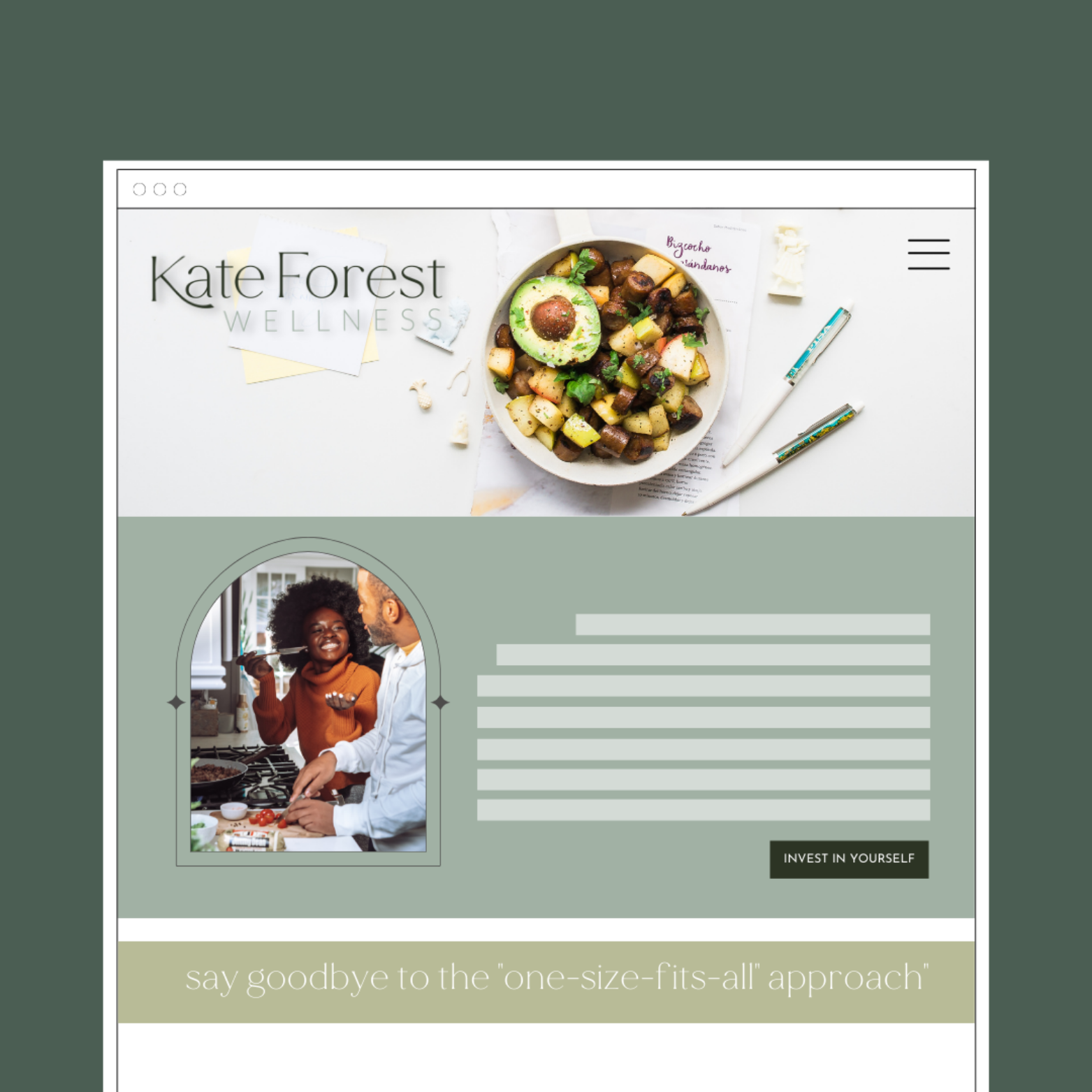
Kate Forest Wellness was designed as a health and nutrition coaching brand focused on whole-body wellness and sustainable lifestyle shifts. The identity combines soft botanicals, calming sage green tones, and a refined serif logo style to create an approachable yet elevated presence.
Scope & Keywords:
Calming • Natural • Refined • Empowering • Balanced
Conceptual website design & layout (desktop and mobile mockups)
Logo and monogram design
Custom brand pattern and supporting graphics
Visual direction for collateral and social media
Style Guide


Brand Story
Kate Forest Wellness was envisioned as a coaching practice dedicated to helping clients achieve sustainable health through personalized approaches. The brand story emphasized empowerment, education, and holistic support.
The conceptual work included a complete identity system and website mockups designed to showcase services, recipes, and educational content. The result was a brand direction that felt polished, trustworthy, and supportive.

Designer’s choice
The logo design is the defining feature of Kate Forest Wellness. The primary mark and monogram balance softness with sophistication — pairing refined typography and subtle botanical details to create a sense of calm and confidence.
The result is a timeless, versatile emblem that perfectly reflects the brand’s focus on holistic wellness and enduring balance.
Let’s Build Something Timeless Together
Every project is a story of transformation — from vision to identity to a polished, professional presence. If you’re ready for a brand that feels timeless and impactful, let’s talk about how we can bring your next chapter to life.